Skincare Superheroes
OBJECTIVE:
Develop packaging for a skincare brand that unites two skincare superhero teams, Acne Squad, and UV Squad, under the collective name ASquad.
APPROACH:
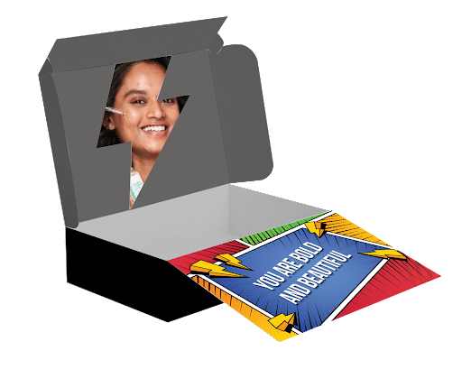
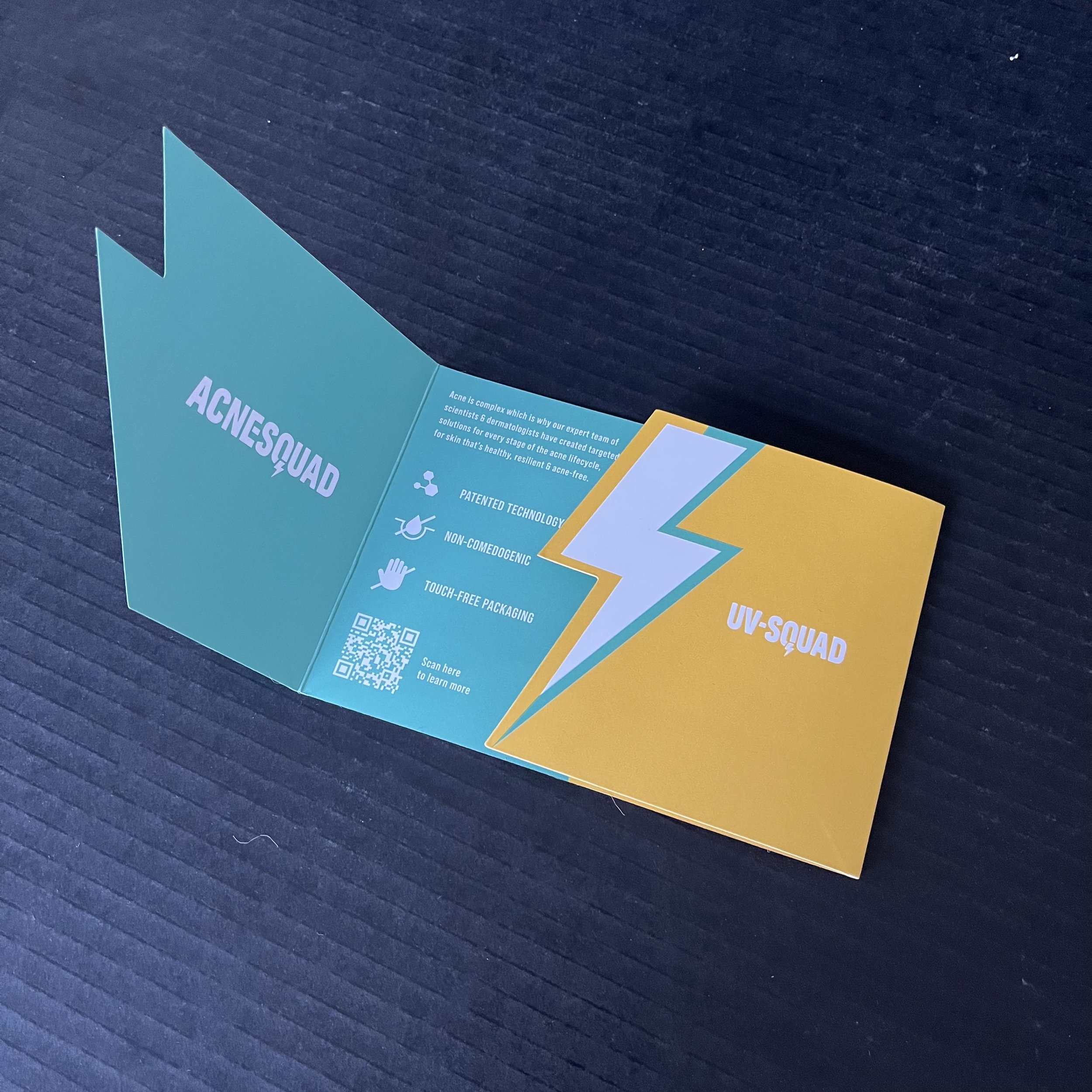
I opted to utilize the brand's BOLT logo as the divider. One side of the packaging is green, representing the Acne Squad, while the other side is yellow, symbolizing the UV Squad. The box is designed to open with a tear strip on the front, revealing a tray where the bolt can be popped to unveil the superheroes ready to rescue. There are two versions of the box; a smaller one accompanied by a unique leaflet containing all the information, featuring a bolt opening and color blocking to represent both squads. The larger box has all the necessary information incorporated directly into the tray. These products derive their vitality from groundbreaking technologies and potent active ingredients, working together to address your skin concerns effectively!
Initial Iterations


Final Packaging


Custom Brochure


A-Squad to the Rescue
Below is the Large D2C box for A-Squad with a printed tray and a bolt to pop to reveal the skincare superheroes.


